Modeling Wuhan Coronavirus (2019-nCoV) Global Cases Dashboard using Power BI — Part 1
Johns Hopkins University Center for Systems Science and Engineering (JHU CSSE) developed an online dashboard (as shown below) to visualize and track the reported cases on a daily timescale using ArcGIS.

They have also provided the complete set of data which is downloadable as a Google sheet, consolidated from various sources, including WHO, U.S. CDC, ECDC China CDC (CCDC), NHC and DXY.
How about trying to create a similar visualization with the public set of data on Power BI?
Below will be the outcome which we hope to develop on Power BI and is can be accessible via https://aka.ms/AA75ccn.

Step 1 — Getting the data
Power BI is able to get data from many sources — from flat files, databases, Azure, online services and many others. For this case as this is a public shareable link, I will be using the web connector to connect to the Google Sheet.

- Create a new Power BI workbook
- In the toolbar, click on “Get Data” and in the pop-up windows, type “web” to filer for the web connector.
- Select “Web” and click “Connect”.

The window prompt for the URL of web source. Below is the provided link to the Google sheet.
JHU CSSE Google Sheet URL
https://docs.google.com/spreadsheets/d/1yZv9w9zRKwrGTaR-YzmAqMefw4wMlaXocejdxZaTs6w/htmlview?usp=sharing&sle=true
If we were to use the given URL, Power BI will treat it as a HTML and scrap the underlying source code for HTML tables due to the parameter “htmlview”.

Edited Google Sheet URL
https://docs.google.com/spreadsheets/d/1yZv9w9zRKwrGTaR-YzmAqMefw4wMlaXocejdxZaTs6w/export?format=xlsx
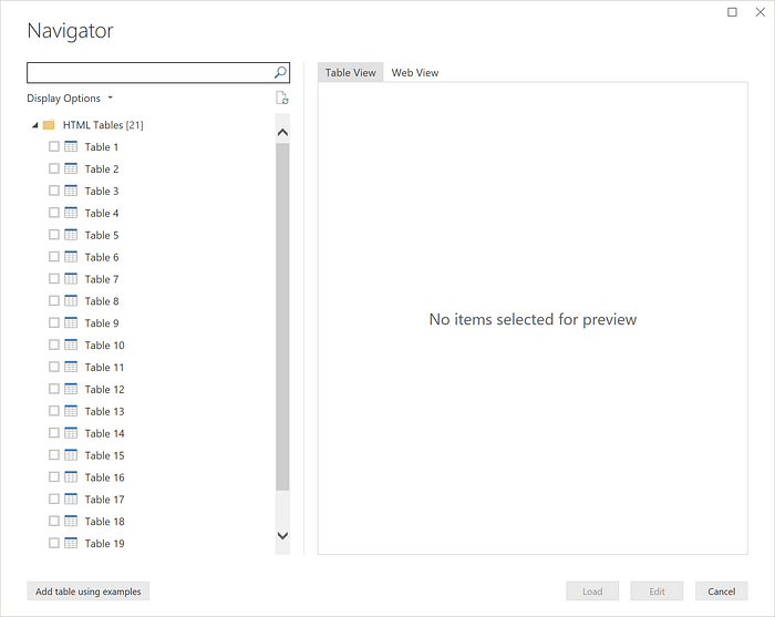
You can tweak the URL to provide the output as an excel instead by changing the parameters in the link — changing from “htmlview” to “export?’format=xlsx”, and the Navigator window will show sheets instead. Enter the new URL into the text box and click “OK”.

The purpose of the report is to show the latest set of data — select the sheet with the latest date/time as the sheet name and click “Edit”. We will be using Power BI to perform simple Extract, Transform, Load (ETL) before creating the visuals. Please take note that we will not be selecting all the available sheets.
Step 2 — Prepare the Data
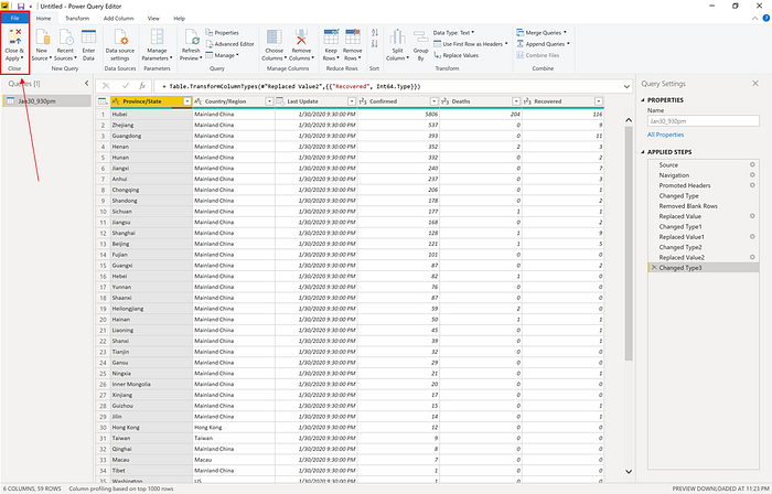
After selecting the data set for editing, the Power Query Editor will open with the raw data.
Quick introduction of Power Query Window

- In the ribbon, many buttons are now active to interact with the data in the query.
- In the left pane, queries are listed and available for selection, viewing, and shaping.
- In the center pane, data from the selected query is displayed and available for shaping.
- The Query Settings pane appears, listing the query’s properties and applied steps.
To understand more details about Power Query Windows, please refer to this link.
ETL
- Remove blank rows.
- Replace all the null values from the following columns — Confirmed, Deaths and Recovered with the value 0.
- Ensure the the data type for all the columns are properly selected.

All the steps you performed during ETL are all recorded in Query Setting window. This is where all steps associated with a query are displayed. As additional shaping steps are applied to the query, they’re captured in the Applied Steps section.
It’s important to know that the underlying data isn’t changed. Rather, Power Query Editor adjusts and shapes its view of the data. It also shapes and adjusts the view of any interaction with the underlying data that occurs based on Power Query Editor’s shaped and modified view of that data.

You can rename steps, delete steps, or reorder the steps as you see fit. Please take note that remove any step in between the sequence will cause the subsequent step to break.

Once you are done, select Close & Apply from Power Query Editor’s File menu. This action applies the changes and closes the editor.

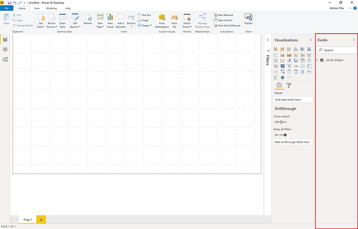
A dialog will display the status of the query and bring us back to the Report view when completed. The newly queried table will be under Fields. Now we are ready to create our report.
Step 3 — Creating the visualization
There are many different visual types available directly from the Power BI Visualizations pane.

You can select the visualization and add fields to a new visualization in the canvas.
Below is the final visualizations for this report:

- Tree Map — Displaying Top N (10) of Confirmed Cases in Mainland China
- Map — Showing all the confirmed cases around the world using bubble to indicate the size of the cases.
- Line Chart — Number of confirmed cases over time: Mainland China vs. Rest of the world.
- Card — Key number such as Confirmed cases, Deaths and Recovered. I did 2 different sections for Worldwide view and Singapore view.
Step 4 — Dynamically getting the latest data set
In Step 1, we manually select the sheet with the latest data. Doing this manually is not sustainable for the following reasons:
- JHU CSSE releases at least 1 sheet on the latest data set for the day itself.
- Not possible to set alert on any changes to the Google Sheet.
- Not possible to keep checking for any changes and apply it manually.
Whenever you refresh the report, all the queries in the workbook will also be refreshed. Based on our selection in Step 1, the query will then always be selecting the sheet “Jan30_930pm” even though there is a newer sheet with the latest data. How can we ensure that the latest data set is being selected whenever a data refresh is done on the Power BI report?
Let’s go back to the Power Query window and open Advanced Editor. To launch the advanced editor, select View from the ribbon, then select Advanced Editor. A window appears, showing the existing query code.

The Advanced Editor lets you see the code that Power Query Editor is creating with each step. It also lets you create your own shaping code. Let’s take the first 2 lines as these are the first 2 steps of the query — Get the data source and selecting the sheet.
Source = Excel.Workbook(Web.Contents(_url_), null, true),In Line 1, a Source variable contains a record of Sheets from the Excel workbook based on the URL indicated.
Jan30_930pm_Sheet = Source{[Item="Jan30_930pm",Kind="Sheet"]}[Data]In Line 2, there are 2 parameters — Item and Kind. Item indicates the name of the selected sheets and Kind refer to the type. This is kind of “hard-coded” to select that designated sheet and we want to remove that dependency.
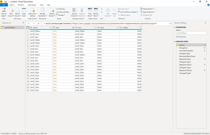
Based on the assumption that whenever the data source loads, the latest sheet will at the first row of the table as shown below.

Hence, let’s modify line 2 to ensure that it will always pick the first row in the table.
Jan30_930pm_Sheet = Source{0}[Data]We remove the parameters in the parenthesis and put in an index 0 instead. This will ensure that the first row will always be selected automatically whenever the data is refreshed. Check to ensure that there is no syntax error and click Close & Apply.
Summary
Using Power BI, we are able to create a similar dashboard from JHU CSSE. With some tweaks in Power Query, we can ensure that the latest data set is used to reflect the updated statistics on this epidemics.
However, at this point, it still requires a human intervention to refresh the data set. In my next post, I will address how to automate the data refresh through Power BI and create a simple flow to trigger the refresh on the fly.
The opinions and views expressed here are those of my own and do not necessarily state or reflect those of Microsoft Singapore or Microsoft Corporation.
